(Inspired by the book, Winning with the P&G 99: 99 Principles and Practices of Procter & Gamble’s Success, by Charlie L. Decker.) If you haven’t read it, I certainly recommend it.
Hopefully, you’ve all seen at least one P&G commercial in your lifetime. A few memorable commercials are the Folger’s commercials, Bounty commercials, and some of the very funny and creative Old Spice commercials. Regardless of what you think about the creativity of those commercials… they work. They may not always be 100% effective, but the majority of them work. That is one of the key reasons P&G have mega brands. Chances are, you have a P&G brand at your home right now.
So the questions are, what techniques do they use in their commercials and how can we apply those techniques, say, on our website landing pages? Today we uncover 8 critical techniques you can start using on your landing pages now.
1) Be obvious about the benefit
Never assume the user will be able to figure out the benefit of what you are offering. Be very blatant and obvious about the primary benefit. In fact, your entire landing page needs to show and support the benefit throughout nearly 90% of the page.
If your product is coffee, your landing page should be full of beautiful photos and benefits. It should give the user the experience of your coffee before they even buy it. Your user needs to be able to imagine themselves sitting at home, drinking YOUR coffee.
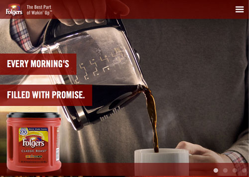
In this example on Folger’s homepage, the very first slide shows a man pouring a cup of coffee. The immediate benefit is “fresh” coffee, and it helps us visualize this in our own home. The tagline even says “The best part of wakin’ up”! (You just hummed the jingle didn’t you?)
2) Get their attention immediately.
P&G commercials nearly always open up with a problem or statement that is intended to relate to their target audience. How do we do this on the web?
First, we have to make sure the page loads fast! 2 seconds is an acceptable load time, because nearly 50% of users expect that! Here’s a startling statistic: If Google increased page load by +500 ms (milliseconds), they get 25% fewer searches.
So after the page loads, what should your user see? They should see a clear headline that tells them what the page is about. Not only that, it should grab their attention. A commercial would use spoken words and accompanying graphics. You could do that on a website, but I do not recommend it. Instead, you can use textual words with attention-grabbing graphics either in the form of static imagery, animation, video, etc. No, I didn’t say scrolling marque with rotating globes and flashing letters. Make it interesting, but not distracting.
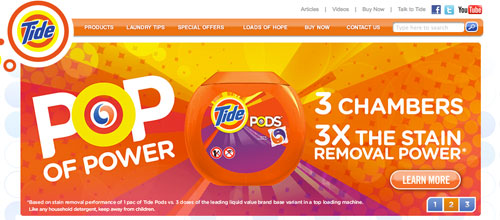
On Tide’s homepage, it’s hard not to notice the bright orange imagery. It might be borderline distracting for some, but for the target audience it delivers immediate attention with short and simple benefit statements.
3) Make the solution the focus, not the problem.
Without a problem, there is no need for a solution. Illustrate the problem to show that you relate to the user, but try not to focus too much of your landing page on the problem.
There should be a balance here. We only need a brief headline or description about the problem. Many times this element is missing from a landing page and the focus is primarily on what a product or service does. Even though a qualified lead to your site is already vetted as having a problem that you solve, the page still needs to confirm that.
A good outlet for this may be an animation or a video, or part of a graphic that is below the fold of your landing page. The main reason for this is to make sure that the “problem” does not get confused with the solution. If you sell car wash soap, you don’t want a photo of a dirty car to be a user’s first impression!
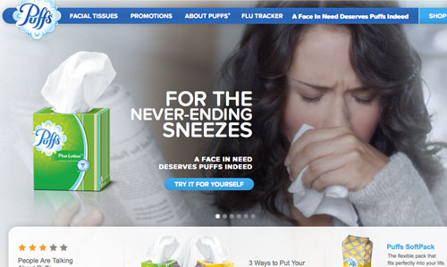
Puff’s does a fantastic job of showing the problem (woman sneezing) with the solution (puff’s tissues), while keeping primary focus on the product and displaying above the fold.
4) Show your product or service above the fold.
P&G commercials show their products in their commercials within the first 1-8 seconds. For websites, this means above the fold and within the initial viewing area.
P&G does this in their commercials so that they can immediately get the brand into the viewers thoughts and memories. In many cases this could be the logo of a product. If you are a service-related company, your logo alone may not be enough to communicate the service you are representing.
5) Can the user see the benefit?
In addition to talking about the benefits of your product or server, show it! This may be different than the main graphic or image you use near the top of the page. What this graphic or animation should show is an illustrative representation of the benefit.
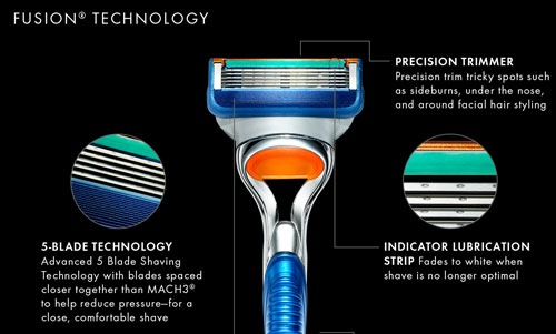
For example, if you sell a superior golf club putter, show closeups of what makes that particular product unique and compare it to other competitive products.
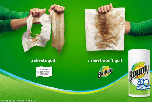
In this example, it’s clear that the benefit of Bounty is its ability to out perform the competitor.
6) Don’t use celebrities, use actual people.
Have you ever seen a commercial with your favorite actor and thought, “wow that was a really cool commercial!” – then a minute later you have no idea what the commercial was about?
That’s because the actor either did not have a strong tie to the product, or was a distraction from the primary focus, the product! Also, it is very difficult to put ourselves into a famous actor’s shoes. We can’t relate. If we see a person we don’t know, who has a similar problem we want to solve, bingo. There is a better chance we will remember that brand and product, and not risk the distraction that comes with famous faces.
7) Keep your copy short and sweet
Digestible. Keep your headlines, bullet points, and sentences digestible. Long sections of copy are daunting and discouraging. You and your reader should be able to understand the benefits and offers of your product or service by scanning all the headlines on your page.
Consider converting large amounts of copy into bullet points. If you need to use a couple paragraphs of copy, make sure they are ONLY supportive of the headline above them and offer useful details.
The worst thing about reading a paragraph of copy is coming to the end and realizing the copy did not explain or elaborate a direct benefit in relation to the headline above it.
Notice how these headline and description combinations entice the user to read the full description. This is because, in context, the description explains the feature in a concise way.
8) Give your user a reason to believe.
By this point, you’ve given your user the benefits of your product or service. Now tell them why! If the benefit of your product helps people in some way, tell the user why.
An example from P&G’s Pantene Pro-V is it promises healthy hair, because of its “exclusive pro-vitamin formula that penetrates root to tip”. The benefit is healthy hair. The “reason to believe” is the pro-vitamin formula.
If your product has a benefit, there is a reason for that benefit and your users need to know what it is. This reason is not only critical to sales, but also a critical element towards establishing a “reason” for customers to become brand evangelists.
Now it’s your turn.
The next time you get a chance to look at an advertisement or tv commercial made by P&G, pay special attention to how the product is presented and how the benefits are portrayed.
Try to use similar techniques on your website to help improve the messaging of your products or services to your users. Don’t worry if your landing page isn’t perfect by tomorrow. Just keep working at it!