An Exploration of the Purpose and Value of an Infographic
By Lorianna Sprague, SEO Specialist
Information graphics have been around far longer than search engine optimization, or even the web. Maps, graphs, charts and histograms are all examples of information conveyed in a graphical format – and early maps first showed up around 7500 BCE. So, needless to say, this is not a new concept – it is simply an old concept re-purposed for current times.
On one hand, an information graphic (infographic for short) is just what the name implies – a graphical representation of information. Generally this information is highly complex, and the use of graphics to convey that information allows viewers to assimilate the data on multiple levels – making it easier to digest and understand.
On the other hand, infographics have become a newly touted way to engage people online, with goals like increasing site traffic, increasing inbound site links, and increasing discussion of a brand through viral link-bait.
Historically speaking, infographics were used to convey data in societies where reading and writing was the domain of the wealthy and the clergy. Today, while basic literacy is more common, especially for internet users, infographics still help people understand data by using visuals to represent things such as relationships, changes in size or quantity; by using colors to show changes in temperature, volume, weight, and to express good/bad or positive/negative values, etc.
But what kind of data are we talking about, and how do we know that people want to assimilate it? Research is a first and vital step in the creation of any infographic. If someone already made an infographic on your topic of choice, then chances are high that no one is going to care about any infographic that you create unless it can do something new, insightful, and do it in a way that gets your audience past the initial “I’ve seen this before” reaction. Say you do your research, and no one has made an infographic about your particular topic yet – awesome. Now it’s time to figure out how big your audience is. If there are only 10 people who care about what you want to create, then word is not going to travel very far. An infographic needs an audience, and it has to fill a need/serve a purpose. But what elements make one infographic more successful than another? And, assuming you can get your infographic to go viral – what does that mean and what are you really getting as a result?
Why Some Perform Better than Others
I tried to compare infographics of similar topics to illustrate that it is not just the aesthetic-aspect of the data that drives its share-ability. The infographics that performed the worst tried to make interesting graphics out of topics like piracy and life insurance. Why didn’t this work? Was it because no one cares about piracy or life insurance? No. The first life insurance infographic was created by a Flickr user who appears to be searching for research opportunities. The data was pulled from 321 surveyed people, a response-volume that surprised the artist/creator behind the infographic, and seemed to make that individual think the infographic was worth creating. It used legos and displayed the data in visually semi-interesting ways, but there is no hook, and too much text. It’s hard to figure out the point of the infographic at a glance, and no easier once you read it.
How did this Life Insurance infographic do with links and social sharing?
- 17 links
- 2 Facebook shares
If an agency created this for a client, the resultant links and social validation would be an epic fail.
The other life insurance infographic approached its rather dry topic from an amusing perspective – Can You Afford to Die? (http://www.termlifeinsurance.org/can-you-afford-to-die-infographic/) Apparently some people found this entertaining and decided to share it with others by linking to it, or by sharing it on social media sites:
- 112 links
- 17 Facebook shares
- 6 Facebook likes
I would call this a good return on a client’s investment. Not every topic will go viral. This point is well illustrated by Mark from Distilled SEO in a post where he explores how many links an infographic should get. The gist? Of the 953 infographics posted by Mint.com in 2010, only about 1% exceeded 50 links. So, really amazing viral results are the exception – not the rule, no matter how amazing an infographic might be.
What Infographics Can Do that Link Building Cannot
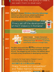
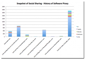
When a client buys link building hours, the links acquired in that block of time are it. They don’t spontaneously create new links on their own after creation. Something infographics have in common with social content, is that they have the potential to generate ongoing links. One of the infographics I found was about the history of software piracy, it used pirate-themes to help convey the data, and made it helpful, funny and interesting. When Starmedia promoted this infographic, they targeted the appropriate audience, and delivered it in the right medium for that audience’s consumption. This infographic didn’t attempt to point fingers or place blame for software piracy – it just gave data.
The resultant sharing took the infographic from 244 links on Starmedia’s site to a total of:
- 1318 links
- 81 Facebook shares
- 124 Facebook likes
- 107 Tweets
- 104 G+
This is the power of engaging real human beings and giving them something they want, need or will enjoy. Being able to deliver means understanding your audience.
A New Twist: The Infographic-Article Power Combo
Most infographics are part of a blog post that includes thoughts, or observations or the like in regard to the infographic. Some of them don’t even have this much. Interestingly enough, the two most successful infographics in the bunch were coupled with well-written articles – the articles explained, and further-fleshed-out aspects of the infographic that required more explanation. The sharing of these articles and infographics far surpassed any of the others. One of the things we keep hearing about content generation is that we need to give people something they want, something informative (and humorous) if we want it to matter. That is what these articles do. They have taken the infographics from being something you look at once to something that is of real value, that you will go back to again and again. If it’s that useful, don’t you think people will want to talk about it? I, personally, found this super helpful. Now I can hang the infographics up, and use them for at-a-glance reference. I. Love. It.
Infographic Social, SEO and Link Building Value
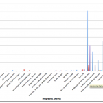
This blog post was spawned from an effort to answer the question, “What are the SEO/Social Media/Link Building values of infographics?” Based on the results, there are some commonalities among the ones that did well versus the ones that did poorly. Of the twenty infographics, one, the n00b Guide to Online Marketing, which was published by Unbounce.com in February of 2011, took the cake for the return-on-time-spent investment. That infographic alone generated upwards of 2000 links, 268 Facebook shares, 451 Facebook Likes, and 1311 Tweets. Those results are amazing!
But the infographic was not published alone, it was the icing to a very long online marketing guide-YouMoz post by Oli Gardner (of Unbounce.com), which generated:
- roughly 4000 links
- 421 Facebook shares
- 313 Facebook likes
- 1722 Tweets
All of which pointed people back to the infographic itself and the Unbounce website. Genius. For me, personally, to generate 6000+ links it would take upwards of 600 hours. That does not include hours spent to increase social media interactions and engagement. Not to mention, the social validation aspect of this scenario and its impact on natural SEO (we already know that Google and Bing take social links into account in their algorithms):
- Brand Awareness – links created naturally by people who were engaged with your company = more value than links designed for Google’s spiders
- Customer Reach – these people know your name, your company, and respect what you have created enough to pass it on to their followers and to follow you
- Customer Acquisition – each of these people has now become a prospect, or an industry peer who respects your knowledge and shares it!
- Improved SEO – Social links improve search rankings
- Take away? Real Human Value
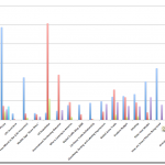
Is this what we can all expect when we sit down to think of the next amazing Chicken Production Equipment infographic for a client? Uh, probably not – but who knows! These are the averages for the infographics analyzed – the first group was analyzed without the data from the two infographics from Unbounce, which got a few thousand links a piece, and without the data for the “life” of the History of Software Piracy infographic, which accumulated over 1300 links through sharing and re-sharing:
Average w/o Unbounce and Piracy “History”
- 70 links
- 53 Facebook shares
- 8 Facebook likes
- 35 Tweets
- 3 G+
Average of all 20 Infographics
- 588 links
- 87 Facebook shares
- 53 Facebook likes
- 221 Tweets
- 8 G+
But these are averages – some of the infographics pulled in 100+ links or 1000+ links and some pulled in less than 20. Now, you should probably take into consideration that some of the infographics analyzed were created two or three years ago, and don’t appear to have been promoted at all following their creation.
What this means in terms of value: Considering a successful infographic can be worth hundreds of hours of link building AND social media, the links are generated by a highly-targeted audience of warm leads at worst, and the social validation is going to increase search rankings? Priceless.

